Production Management
Welcome to my Blogger profile. My name is Katie Williams and I shall be using this blog for my college work. The units I am currently working on is Unit, 3, 4 and 18. The deadline for this unit is 25/05.2012. Throughout the unit I will update my blog everyday until I finish this unit. In the unit I shall be creating my own company and creating a name, logo, and other products for the company which I have created.
Thursday, 24 May 2012
24.05.2012
I have got my folder in the order of what it is needed. I have also completed my evaluation for the overall unit including a few comments. I have also put the comment sheet into the folder too.
Friday, 18 May 2012
Friday's Lesson
In lesson i have printed off my two packages and my poster. I just need to cut it and stick it together ready for monday's lesson were people can view my finished packages. I have also created a comment sheet for people to comment on in Monday's lesson.
Wednesday, 16 May 2012
Mistake - now fixed!
After college I went home and decided to print off both my packages in black and white, then in full colour. I am leaving the black and white print outs as my examples to place into my folder to show the black and white version of the packages. With the colour versions I have cut them out and stuck them together to see if there was anything wrong or that needs fixing. I did discover that on my 'Bath Salts' packaging I had made a mistake and I am glad I printed these colour copy examples out. I have also found a mistake on my 'Bubble Bath' product but I have managed to fix them both and now I just need to take the dotted lines off and then I am ready to print during Friday's lesson!! The mistake was easily fixed but if it wasn't for printing a plan I wouldn't have been aware that I had a mistake. I have now fixed this mistake and I am happy with the poster and both packages.
Completed poster
Here is my finished poster. I did change my origional plan from putting the two photographs in the centre to advertise the products. However I decided to just base the poster on the company and getting the company known more. I still kept it very similar to how i origionally planned but I have just added that there is a new company opening in the Sheffield location and that the company sells certain products. I definatly feel happier with the change i have made to my poster. Next lesson I will be printing my poster of, and also my Bath salts packaging on an A4 paper and my bubble bath packaging onto a A3 sized paper.
Complete packages
Completed
Packaging 1 - Bath Salts
- I have now completed my 'Bath Salts' packaging. The pages which are blank are the ones which are going to be inside the box and will not be seen until the product is actually open. I have used a lighter grey on the side of the packages, because I just want the 'Bath Salts' and the logo to be more noticed by my target audience. I have used the green on the logo to show the more natural side of the company because it is a natural typed shop which sells those types of product. I also used flowers to and curved brushes to show that I want it to be aimed mostly at females. I have also added the location of the company onto the underneath of the packaging so people know where the company is located and can continue to shop at the company location.
Packaging 2 - Bubble Bath
- I have also completed my packaging for my 'Bubble Bath' packaging. Pretty much the same as the other packaging description. On this packaging I have used a different colour to the other packaging and I have also used the word 'Bubble Bath' twice but in a lighter colour on one side. I have again used the same brushes because these two products would be linked together if I did have the actual company. I have left two sides blank but I think it looks good without needed anything on the pages because the logo and the product name is showen in the right places. Same as the other packaging I have added the location on the back of the box so people know where to continue shopping for that product. Altogether I feel the products looks simple but effective and would attract people to the company and the company products. I shall be printing these out at some point before Friday (18.05.2012).
Monday, 14 May 2012
This is my final print screen of the bath salts packaging. I had added the location of the company onto the bottom of the box so then people know where it's location is and the bar code is on there too.
I have now started my second packaging for my bubble bath product. I have again used the logo for the company on the packaging. I have also added the 'Bubble Bath' text onto the top of the packaging too. Below I have added the bar code which again I slightly created using a website I found. On the third photo I have used the same brushes from the other packaging so then it didn't look different or out of place. The forth photo is of my almost completed design, however I am still deciding what to add onto the two side pannels of the box. I shall also be placing the words 'bubble bath' on the opposite side too but maybe in a lighter grey.
Friday, 11 May 2012
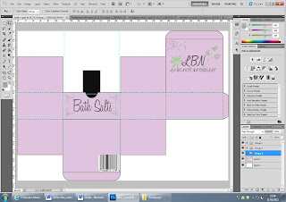
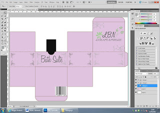
I have got my template from the template book and I am editing it in Photoshop CS5. I have copied my logo over onto the packaging and added another flower brush tool onto the box above it.


I then added the word 'bath salts' onto the packages and used brush tools around it to give it a nice look and it shows people what the product is. The second photo is then of the almost finished packaging. I have put brush tools around all the sides of the box so it doesn't look plan. I think it looks simple yet effective. I have then used different grey colours around the outside to again give it a nice complete look.
Subscribe to:
Comments (Atom)


